


Iranian calligraphy
An interview with Saeed Naghashian

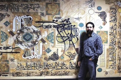
Saeed Naghashian, born in 1977 in Tehran, has honed his craft both under master calligraphers and at university, where he studied graphic design. He currently teaches graphic arts at various universities in Iran and has a particular interest in typography. In his work, Saeed employs elements inspired by graphic art and Iranian calligraphy. Djamileh Zia spoke to him about his work with marrying traditional Iranian art with contemporary graphics
Please tell us about your professional and artistic background?
I started studying calligraphy in 1990 at the Iranian Association of Calligraphers. I then entered the University Soureh in 1996, where I studied graphic design. One of my teachers was Mr. Ajami, who invented the calligraphic style known as mo’allah. My interest in calligraphy increased as I took courses with him. I started learning mo’allah with Mr. Ajami in 1998 and have presented my work in numerous exhibitions, both individual and collective, since 1998. The exhibition in Tehran last December is my 10th solo exhibition.
You also teach graphic art, don’t you?
Yes. I teach graphic design, and the role of calligraphy in traditional Iranian arts and graphic design, at various universities. Overall, my interests are Persian calligraphy and graphic design, especially typography.
Can you say something about typography?
Graphic design is an applied art. It is a visual language used to convey a message through various elements such as colours, images, and words. Typography is the art of using words as an element of graphic design. The letters of the alphabet, arranged on the page or canvas, become part of the image created by the designer. Iranian graphic designers often use calligraphy in their work. In this manner, calligraphy becomes an applied art — which goes beyond the scope of traditional calligraphy — and is placed in the context of what we call typography. Iranian and Islamic calligraphy have great potential to be used in typography; in fact there are several styles of typography that have developed out of them, including nast’aligh, shekasteh, and others. I have personally experimented a great deal with this medium, especially as I have been practicing mo’alla for several years — it is a style with great graphic potential.
So your professional and artistic activity essentially focuses on the use of Persian calligraphy in graphic design?
You could say that I try to use elements found in traditional Iranian and Islamic art — be it the choice of colours, the quality of the matting, pictorial motifs, or other things — while at the same time placing myself in a modern context. This way, potential audiences in other countries, who are not familiar with the traditional art of Iran, can still establish a link with what I do.
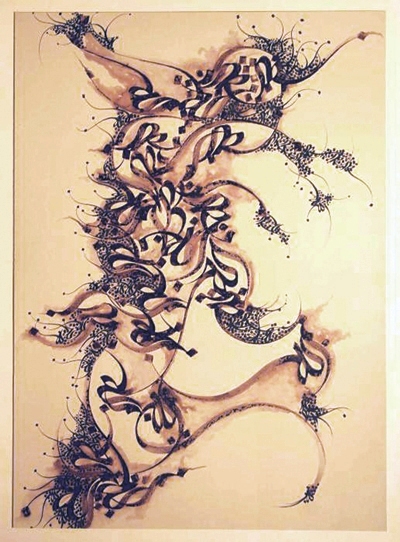
Your recent pictures exhibited are described as “calligraphy-paintings”. Can you explain what this means?
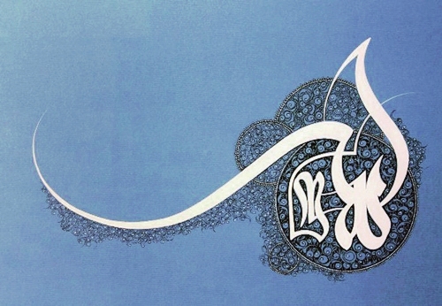
In these paintings, I focused on the different names of God which we use to invoke him or speak to him, or the names of the Shiite Imams. For example, in one of the paintings I wrote ‘Allah’ and in another ‘Hou’; others feature the names ‘Hussein’ or ‘Ali-Asghar’. I find that words have such inherent energy that they attract attention wherever they are. I wish for these sacred names to be present in my life and the lives of others. In other works, I wanted to express a gnostic concept. In one painting called Sama, I was inspired by Vojoud Vahdat-e, the oneness of being, and I depicted the world as revolving around a central point; the only point where one perceives tranquility. The rotations in the painting turn into a dance for he who has nothing but God in his spirit.
You often use Iranian pictorial motifs, such as the form of the cypress, or the spirals commonly known in the West as arabesques. These motifs are in fact from the Sasanide period of Iranian art, right?
Yes, I use quite traditional Iranian pictorials in my work. The colouring for example: I use the colours of the earth, turquoise, ocher, and agate; and I also employ drawings evoking the cypress or the flame, symbols which are embedded in Iranian culture since ancient times. These shapes inspire a feeling of freedom, of moving towards the heavens. That is why I left a blank space at the top of most of my paintings, so that the viewer’s gaze is not confined but instead induced to move upwards.
In many of your paintings, you have laid fine gold or copper leaf and traced spiral forms on them. This is an innovation of your own, is it not?
I have never seen this kind of work elsewhere, so yes, we can say that it is an innovation on my part.
How do you trace these designs on gold and copper leaf?
I use a moghar, which is a metal tool with an extremely thin and flexible tip. As you can notice, the shapes drawn on gold or copper leaf harmonize with the rest of the motifs in the painting. In graphic design, it is very important that the various elements on the page are in harmony with each other. This way, the eye is drawn across the image and can take in all of its parts, instead of stopping at one point.
Do you draw these spiralling designs in one sitting?
Yes. I begin from one point, and the rest follows.
Are there any other innovations in your paintings?
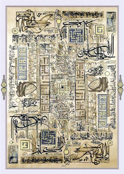
To some of my paintings, I have added gemstones, agate or turquoise which is something that never had been done before. The response from visitors has been very positive on this point. In other works, I have placed the same drawing or piece of text symmetrically around a symbolic centre to represent Mecca or the Mausoleum of Imam Reza. The whole canvas is arranged symmetrically around this central point as a reference to Plato, who wrote that everything that exists in this world is an image of something that exists in heaven. Moreover, in these paintings, I use all of the different types of Islamic calligraphy, from the first form of Kufic script which is the oldest right up to the most recent calligraphic styles such as mo’alla.
Do you have the finished painting in mind before you begin to work, or do you improvise and add different elements as you go?
I have the whole thing in mind, and I begin with the central element.
You have exhibited your work in several European countries recently, haven’t you ?
Yes. During the past two years I have exhibited my paintings and found myself working in ateliers in several foreign countries. In September 2009, I was in Torre Canaves, which is a village near Turin, Italy. In September 2010, I was at the Cité des Arts in Paris and in Minsk, Belarus. On each occasion, the reaction of my audiences has been very enthusiastic.
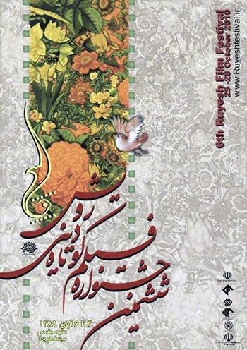
And have also designed book covers and posters?
Yes. For a long time, I have been designing jackets for books with mystical themes, working with a number of publishing houses. I also designed the poster for the fifth and sixth editions of Rouyesh, a festival of short films with religious themes. There again, I used graphics from the Iranian tradition and took into account the fundamental principles of Iranian mysticism, both in the choice of colours and the overall harmony of the layout.
Any final thoughts?
Most graphic designers use modern Western typefaces in their creations, but I find these characters to be discordant with the Iranian cultural atmosphere. This is why I tend not to use anything but Iranian calligraphy in my own work. Our calligraphy tradition is very rich and very beautiful. I find that its use in graphic design holds great potential and increases the image’s ability to communicate. In another sense, artwork which involves elements of Iranian calligraphy creates an opportunity to introduce the world to Persian writing.
Interview by Djamileh Zia, originally published by La revue de Téhéran and translated by Erin O’Halloran.