


Linguistic links

Speaking with others about her native language Arabic, graphic and type designer Rana Abou Rjeily discovered that many believe it to be very difficult, almost unattainable, and miles apart from English and other European tongues. It was then that the idea of a book explaining in a visual way the basics of Arabic was born. This year, her Cultural Connectives was published.
Rana, a graphic designer who also teaches typography at Lebanon’s Notre Dame University, was educated at Central Saint Martins in London. During her masters studies, which were specialised in type design and language, she realised how limited the knowledge of Arabic was among her co-students and colleagues. “I came to London expecting to get fresh ideas, new perspectives and learn about initiatives concentrated on Arabic,” says Rana. “But, it turned out that most people knew nothing about the language.” She continues: “I also had a very hard time explaining to others the basics of Arabic. At that point, I decided to do something about it.”
“I came to London expecting to get fresh ideas, new perspectives and learn about initiatives concentrated on Arabic. But it turned out that most people knew nothing about the language.”
Five years later, Rana released her book in February this year. “It’s a two-folded project, which both explains basic differences between the Arabic and Latin scripts, and introduces Mirsaal, a typeface which is a match-between the two alphabets with a set of simplified Arabic letters.” Her target group is anyone interested in Arabic, but mainly those who do not yet speak the language. “The book sends out the message that Arabic is something comprehensible. Yes, it is a complicated language, but it is accessible.”
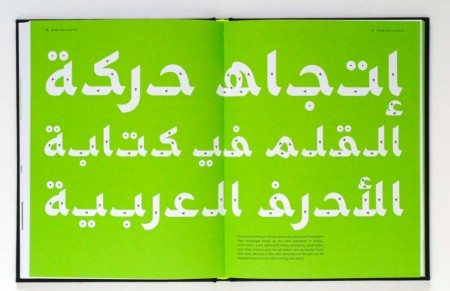
She continues: “The book is made in a simple way, so that anyone can read and enjoy it. The idea is to present an introduction to the language, not an advanced lesson. Therefore, only a tiny bit of grammar is included, the absolutely necessary part.” Visualised in a clean and stylish fusion of black and bright green, the book speaks the language of a designer. “My profession is graphic design, so the book is made from this perspective,” says Rana. “A linguist for example, would have done the same book differently.”
Her project is set in a tradition of more than fifty years of exploring with ways to simplify the Arabic script. Rana: “There have been several attempts to create an alphabet with detached and uncomplicated letters, to make it easier for beginners to learn and understand it. The first draft was Lebanese Nasri Khattar’s Unified Arabic from 1951, and my Mirsaal is an attempt to work with the same concept: making each letter look the same regardless of where it stands in a word, not changing shape like they traditionally do in Arabic.”
“The book sends out the message that Arabic is something comprehensible. Yes, it is a complicated language, but it is accessible.”
She continues: “Some people have asked why I want to substitute Arabic letters with a new disconnected alphabet, but that is not what I am doing. You have to see the book as an entity in itself: it is not meant to replace traditional Arabic but to present a fresh perspective and a bridge to the Latin script.” Despite working with contemporary font design, Rana is keen on preserving the long-established aesthetics of Arabic. “I really appreciate the nature of the script, the traditional connection between artistic expression and functionality. Since Islam teaches not to portray living beings, calligraphy has always flourished in this part of the world, and we have a rich heritage of the written word.”
Indeed, calligraphy is one of the main sources of inspiration for Rana’s work. “I always refer to a calligrapher when I need expertise: they understand how letters move and work together. Everyone working with Arabic typography should have at least a nominal knowledge of calligraphy and learn the foundations of this art form, even though calligraphy and font design do not have to be directly connected at every point in time.” The Mirsaal font – a modern-looking and clean font, with detached simple letters in contrast to calligraphy’s often intricate and ornamental writing – nonetheless contains basic calligraphic elements. Rana: “It is not deprived of facets of handwriting, quite the opposite. It has a strong feeling of hand movement, and integrates thick and thin strokes.”
“Some people have asked why I want to substitute Arabic letters with a new disconnected alphabet, but that is not what I am doing.”
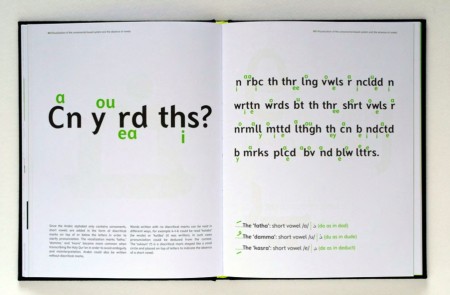
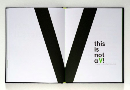
The work with Cultural Connectives involved more of this sort of simultaneously looking to the past and the future: researching for the book, Rana found herself revisiting her childhood years and how she experienced learning Arabic. “I remember finding it difficult to learn the language as a kid. It was harder to perfect reading and writing Arabic than it was to master English and French. This is true for many children. I came across an article just the other day, describing how Arabic is more challenging for the brain than many other scripts. Many students have problems with differentiating the letters and learning each character’s four different shapes.” Rana continues: “I also used experiences of my own as a point of reference, like the illustration ‘This is not a V’. I used to say that to myself not to confuse the number seven with the letter V.”
As the title suggests, the book has a purpose that goes beyond graphic creation. The core of the project is to provide a point of connection: not only between the Arabic and Latin letters, but also between societies where people use these. Rana says that, although the idea of bridging different cultures never was a set goal, it remains an important part of the book. “There is definitely a notion that touches upon cultural meetings and making different people understand each other. Also, the book is about ‘Easternising the West’. Usually it works the other way around, with the East being subject to Westernisation. In my book, I do the opposite: I apply Arabic rules to Latin letters and a Western language.”
“The book is about ‘Easternising the West’. Usually it works the other way around. In my book, I do the opposite”
The design also represents the meeting of two worlds, and the dual use of black and bright green symbolises the integration of the two languages. “When working on choosing colours, I first looked at what colours were traditionally used in Arabic script, and saw that dark shades of blue and red were very common. I found these overused, and wanted to do something different. Therefore, it was rather through elimination that green came out as a good choice. Interestingly, some people ask me if it has a religious meaning since green is the traditional color of Islam, but this is not the case. The green that I use is very different from the Islamic green, and the choice was a purely graphical one.”
“Right now, Arabic typography is booming.”
Both a graphic introduction to Arabic and a note on cultural encounters, Rana’s book is in sync with an increase in East-West encounters. Her simplified Arabic script is intended to be used for teaching Arabic as a second language, and the book presents a visual counter-argument to the idea that the tongue is inaccessible for English speakers. Her project is also set in the context of a changing environment of Arabic font design. “Right now, Arabic typography is booming,” says Rana. “But it is still a recent thing. There are not many books on the topic; most publications deal with calligraphy and not graphic fonts. Also, they are largely produced by non-Arabic speakers. We learned our typography from the West! This is not necessarily a bad thing, but I wanted to know how it would look from another perspective.” She continues to describe an interesting shift that is taking place: “Whereas fonts used to be within the domain of printers and architects, it is now mainly done by graphic designers. Our perspective on typography is different and more aesthetic. So, now is a great time for experiments. There is a big room for new thinking and inspiration.”
2 thoughts on “Linguistic links”
Leave a Reply
You must be logged in to post a comment.
here’s a nice post about the same book:
http://vijainqatar.wordpress.com/2011/05/23/cultural-connectives/